
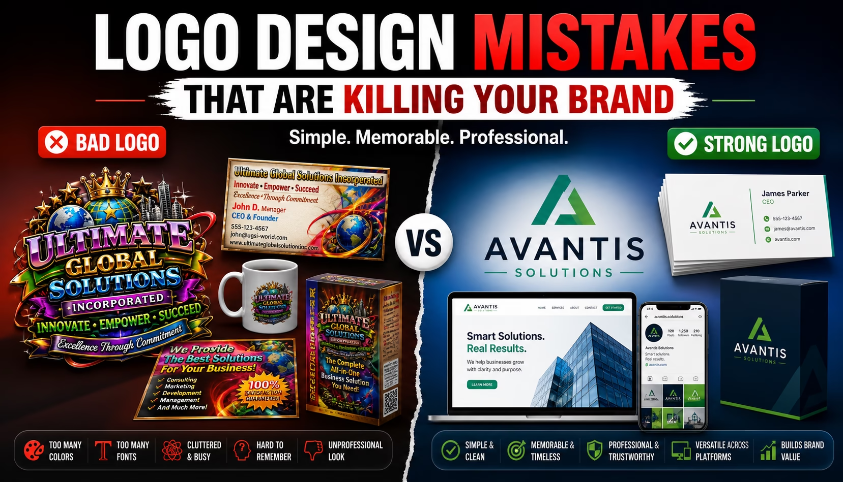
Let’s be honest.
Most bad logos don’t look bad because the business owner didn’t care.
They look bad because the logo was created without strategy.
A logo is not just a small icon beside your business name. It is the face of your brand. It appears on your website, packaging, social media, business card, invoices, products, ads, brochures, and almost everywhere your business shows up.
So when your logo looks weak, outdated, confusing, or amateur, customers notice.
They may not say, “This logo has poor balance and weak typography.”
But they will think:
“This brand doesn’t look professional.”
And that tiny thought can quietly kill trust.
That is why avoiding common logo design mistakes is so important. A strong logo helps your brand look reliable, memorable, and ready for business. A weak logo does the opposite.
If you are looking for reliable design options and want to avoid wasting money, first read this guide on high-quality graphic design services that actually convert.
Table of Contents
- Why Your Logo Matters More Than You Think
- Mistake 1: Making the Logo Too Complicated
- Mistake 2: Using Too Many Colors
- Mistake 3: Choosing the Wrong Font
- Mistake 4: Following Trends Blindly
- Mistake 5: Copying Competitors
- Mistake 6: Ignoring Scalability
- Mistake 7: Designing Without a Brand Strategy
- Mistake 8: Using Low-Quality or Generic Icons
- Mistake 9: Not Testing the Logo in Real Use
- Mistake 10: Thinking Cheap Logo Design Saves Money
- What Makes a Good Logo?
- Where to Get a Professional Logo Design
- Final Thoughts
- FAQs
Why Your Logo Matters More Than You Think
Your logo is often the first visual detail people remember about your brand.
Before customers read your story, compare your pricing, or understand your service, they see your logo.
A good logo can make your business feel:
- professional
- trustworthy
- memorable
- organized
- serious
- established
A bad logo can make your business feel:
- cheap
- confusing
- outdated
- unreliable
- inexperienced
That sounds harsh, but design works fast. People make visual judgments in seconds.
And in business, seconds matter.
A logo does not need to explain everything your company does. It needs to create the right impression and work consistently across all brand materials.
That is where many businesses make mistakes.
Mistake 1: Making the Logo Too Complicated
This is one of the most common logo design mistakes.
Some business owners want everything inside the logo:
- full product concept
- multiple icons
- tagline
- hidden meaning
- 3D effect
- gradient
- shadow
- symbol
- long business name
The result?
A logo that looks like a crowded poster.
A strong logo should be simple enough to remember and flexible enough to use everywhere.
Think about famous brands. Most of them do not use complicated logos. They use clean, memorable, recognizable marks.
Simple does not mean boring.
Simple means focused.
A complicated logo may look interesting at first, but it usually fails in real use. It becomes unreadable on small screens, messy on packaging, weak on social media, and hard to remember.
Better approach:
Keep the logo clean, balanced, and easy to identify.
Your logo should work even when someone sees it for only two seconds.
Mistake 2: Using Too Many Colors
Color is powerful.
But too many colors can turn your logo into a visual traffic jam.
A common mistake is using four, five, or six colors without any clear reason. This can make the logo harder to print, harder to remember, and harder to use across different platforms.
A strong logo usually works well in:
- full color
- black
- white
- grayscale
- small size
- large size
If your logo only looks good in one colorful version, it is not flexible enough.
Colors should support your brand personality.
For example:
- blue can feel trustworthy and professional
- green can feel natural, fresh, or healthy
- red can feel bold, energetic, or urgent
- black can feel premium, strong, or minimal
- orange can feel friendly, creative, or active
But color should be intentional, not random.
Better approach:
Use a limited color palette and make sure your logo works in one-color format too.
That is how real brand systems survive.
Mistake 3: Choosing the Wrong Font
Typography can make or break a logo.
A poor font choice can make your business look childish, cheap, outdated, or unprofessional.
Some common font mistakes include:
- using decorative fonts that are hard to read
- using trendy fonts that expire quickly
- mixing too many fonts
- choosing fonts that do not match the business
- using free fonts without checking licensing
- using thin fonts that disappear in small sizes
Your font should match your brand personality.
A law firm should not look like a toy shop.
A kids’ brand should not look like a bank.
A luxury skincare brand should not look like a discount electronics store.
Typography silently tells people what kind of brand you are.
Better approach:
Choose a clean, readable, brand-appropriate font. Then adjust spacing, weight, and proportion carefully.
Good logo typography looks effortless, but behind the curtain, every curve is doing gym training.
Mistake 4: Following Trends Blindly
Trends can be useful for inspiration.
But building your entire logo around a trend is risky.
Trendy logos often age quickly.
Today it looks fresh. Tomorrow it looks overused. Next year it looks like everyone else.
Common logo trends that can become outdated include:
- generic gradient icons
- overused geometric symbols
- random minimal line art
- trendy lowercase wordmarks
- excessive 3D effects
- AI-looking abstract marks with no meaning
A logo should last for years, not just one social media season.
That does not mean your logo must look old-fashioned. It should feel modern but not disposable.
Better approach:
Create a timeless foundation first. Then add modern touches carefully.
Good branding respects the future but does not throw tradition into the river.
Mistake 5: Copying Competitors
Looking at competitors is smart.
Copying them is not.
Many businesses think, “Our competitor is successful, so let’s create something similar.”
That creates a serious problem:
You become forgettable.
If your logo looks too close to another brand, customers may confuse you or see you as a weaker version of the original.
Competitor research should help you understand the market, not clone it.
Your logo should:
- fit your industry
- feel relevant to your audience
- still have its own identity
- separate you from similar businesses
Better approach:
Study competitors to find gaps.
Ask:
- What colors are overused?
- What shapes are common?
- What style does everyone follow?
- How can my brand look familiar but still different?
That is where the magic sits.
Mistake 6: Ignoring Scalability
A logo must work everywhere.
That includes:
- website header
- mobile app icon
- social media profile photo
- product label
- packaging
- invoice
- business card
- billboard
- email signature
- embroidery
- stamp
- black-and-white print
One of the biggest logo design mistakes is creating a logo that looks good only in a large preview.
But real life is messy.
Your logo may appear as a tiny favicon, a social media thumbnail, or a small label on packaging.
If it becomes unreadable at small size, it fails.
Better approach:
Test the logo at different sizes before finalizing.
A professional logo should be clear at both large and small sizes.
Mistake 7: Designing Without a Brand Strategy
A logo without strategy is just decoration.
Before designing a logo, it’s essential to understand the following points; consequently, this knowledge will guide your creative process:
- who the brand serves
- what the brand promises
- what makes it different
- what emotion it should create
- where the logo will be used
- what competitors look like
- what style fits the business goal
Without these answers, the logo becomes guesswork.
And guesswork is expensive.
A strong logo should connect with your full brand identity. That means it should work with your color palette, typography, packaging, website, social posts, brochures, and marketing materials.
You can learn more from this guide on building a strong visual identity for your brand.
A logo is the seed. Branding is the tree.
Plant badly, and the whole forest gets awkward.
Mistake 8: Using Low-Quality or Generic Icons
This one is everywhere.
A business needs a logo fast, so someone grabs a free icon, adds a name, and calls it a logo.
The problem?
Thousands of other businesses may be using the same icon.
Generic icons make your brand look:
- unoriginal
- cheap
- forgettable
- less trustworthy
This is especially risky for industries like:
- real estate
- tech
- food
- beauty
- health
- consulting
- construction
- eCommerce
Because many brands already use the same basic symbols.
A house icon for real estate.
A leaf icon for organic products.
A gear icon for engineering.
A shopping cart icon for eCommerce.
These can work, but only if they are customized with smart execution.
Better approach:
Use custom shapes, refined typography, and a unique visual direction instead of relying on generic stock icons.
Mistake 9: Not Testing the Logo in Real Use
A logo can look great on a clean white artboard.
But business does not happen on artboards.
Your logo needs to be tested in real-world situations.
Test it on:
- product packaging
- business card
- website header
- social media profile
- brochure cover
- email signature
- black background
- white background
- small mobile screen
This is where many weak logos collapse.
The text might become illegible at times.
The icon could lose its intricate details.
The colors may appear lackluster when printed.
The logo might not seamlessly integrate with the packaging.
Real testing saves future pain.
For product-based businesses, this is especially important because logo design and packaging design must work together. You can also read this article about the importance of packaging design for product sales.
A logo should not just look good alone.
It should behave well in the wild.
Mistake 10: Thinking Cheap Logo Design Saves Money
Cheap logo design can look like a bargain at first.
But if the logo fails, you may pay more later for:
- redesign
- rebranding
- new packaging
- updated website
- changed marketing materials
- lost brand recognition
- customer confusion
That “cheap” logo can become very expensive.
This does not mean you need to spend a crazy amount.
It means you should choose value, not just price.
A professional logo should come with:
- strong concept
- clean execution
- proper file formats
- scalable vector version
- brand-appropriate typography
- usable color variations
- transparent background
- print and digital readiness
If a logo only arrives as a low-resolution image, that is not a professional brand asset.
That is a future headache wearing a tiny hat.
What Makes a Good Logo?
A good logo is not always the most artistic one.
A good logo is the one that works.
It should be:
- simple
- memorable
- scalable
- readable
- relevant
- unique
- timeless
- flexible
- brand-appropriate
Most importantly, it should make your business look trustworthy.
A professional logo gives your brand confidence before you even speak.
And that is valuable.
Where to Get a Professional Logo Design
If you want a logo that looks clean, professional, and actually works for your brand, hire a designer who understands more than decoration.
You need someone who understands:
- brand identity
- typography
- color psychology
- layout balance
- logo usability
- print and digital files
- long-term brand consistency
For a clean and professional logo design service, you can check this offer:
Get a simple and unique logo design that works for your brand
This is useful for:
- startups
- small businesses
- product brands
- online shops
- personal brands
- service businesses
- corporate identity projects
And if you already have an idea but need help turning it into a professional design, you can also explore this service:
Turn any idea into a professional graphic design
The goal is not just to get a logo.
The goal is to get a logo that can grow with your business.
Final Thoughts
Logo design mistakes are not small problems.
They affect how customers see your business, how professional you appear, and how easily people remember your brand.
A weak logo can make your brand feel cheap.
A strong logo can make your business feel trustworthy before customers even read a word.
So do not treat your logo as a quick decoration.
Treat it as a serious business asset.
Because your logo is often the first handshake between your brand and your customer.
Make sure it does not have sweaty palms.
FAQs
The most common logo design mistakes include making the logo too complicated, using too many colors, choosing the wrong font, copying competitors, ignoring scalability, and designing without a clear brand strategy.
A simple logo is generally more effective; therefore, it is easier to remember, recognize, and use across websites, packaging, social media, print materials, and small screen sizes.
Your logo may be ineffective if, for example, it is difficult to read, appears outdated, contains too many elements, does not scale well for small sizes, resembles competitors’ logos, or fails to align with your brand personality.
Your logo can include modern design touches, but it should not depend completely on trends. Trend-based logos often become outdated quickly. A good logo should be timeless and flexible.
You should redesign your logo when it looks outdated, does not match your business anymore, fails to work across platforms, confuses customers, or makes your brand look less professional than competitors.
Related graphic design service guides
Use these connected Tanur Graphics guides to compare services, avoid hiring mistakes, and choose the right design support for your business.