
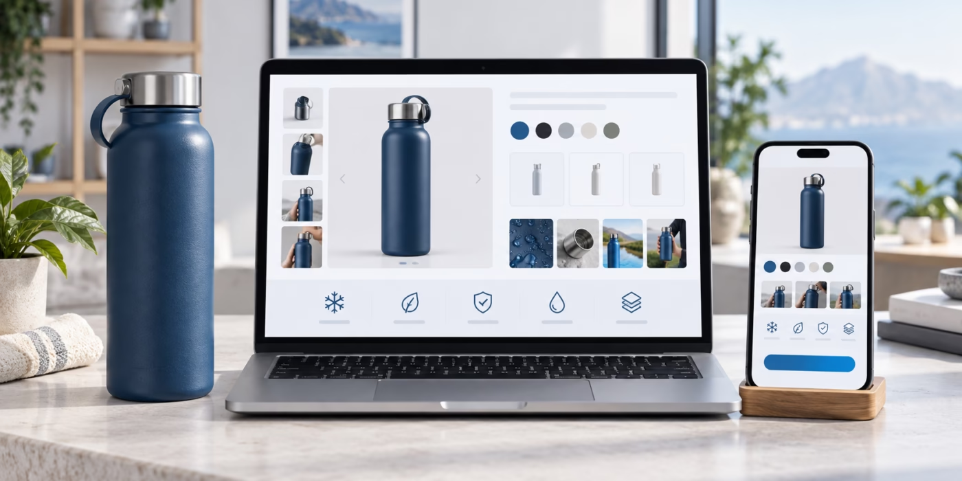
Ecommerce Product Page Graphics That Reduce Buyer Uncertainty
Online shoppers cannot hold the product, inspect the finish or ask a salesperson to point out every detail. Effective ecommerce product page graphics close part of that gap. They show what the product is, how it works, how large it feels, which version to choose and what arrives after purchase.
The goal is not to decorate the page with more images. It is to answer the buyer’s most important visual questions in a deliberate order.
Start with the buyer’s uncertainty list
Review customer questions, returns, support messages, reviews and sales objections. Group uncertainty into themes such as size, material, compatibility, setup, ingredients, included items, colour, care, delivery or results.
Turn each important question into a visual job. If shoppers ask whether a bottle fits a cup holder, show dimensions and a contextual scale. If they confuse two models, create a comparison graphic. If packaging quality supports the price, show the unboxing experience.
For product photography fundamentals, see background removal for ecommerce and keep the image style consistent across the catalog.
Build a useful image sequence
The first image should identify the exact product quickly. The next images should reduce risk in a logical order. A practical sequence can include:
1. Clean hero view with accurate colour and shape.
2. Alternate angles and important close-ups.
3. Size and scale graphic with meaningful dimensions.
4. Key feature or material explanation.
5. Use-context image for the target customer.
6. Variant or model comparison.
7. Included-items and packaging image.
8. Care, setup or next-step graphic when needed.
Not every product needs eight graphics. Use the smallest set that supports a confident decision.
Design the hero image for recognition
Keep the product large enough to understand on mobile and in marketplace thumbnails. Use a background that separates the silhouette clearly and does not change the perceived colour. Avoid decorative props that suggest items are included when they are not.
For Amazon, Google, Shopify or another channel, follow the current platform image rules and product-data specifications. Google’s official Merchant Center product data specification is one example of why channel requirements should be checked before production.
Explain size without forcing mental maths
Dimensions alone can be abstract. Combine precise measurements with a familiar context when that comparison is accurate. A package can be shown in a hand, on a shelf or beside an appropriate everyday object. Keep the scale honest and label whether dimensions refer to the product, package or shipping carton.
For apparel or fitted products, include measurement instructions and explain tolerance. For furniture or equipment, show clearance, access and installation dimensions as appropriate.
Turn features into buyer outcomes
Feature graphics should connect a fact to a practical benefit without exaggeration. “Double-wall stainless steel” may support temperature retention and durability; the graphic should show the construction and use case, not make an unsupported performance claim.
Use short headings, one visual idea per frame and readable contrast. Decorative icons are useful only when their meaning is obvious. Important information should not exist only inside an image if it is also needed for accessibility, search or translation.
Make variants easy to compare
When buyers choose between sizes, models, flavours or bundles, a consistent comparison system reduces mistakes. Use the same order, units and labels for every option. Highlight meaningful differences rather than giving every feature equal visual weight.
If packaging changes by SKU, the visual identity should make the family coherent while keeping each variant easy to recognise. Read how professional packaging and brand identity design supports product sales.
Show trust with evidence
Useful trust graphics can show materials, construction, real details, guarantees, supplied certifications, packaging contents or process transparency. Claims need evidence and client approval. Reviews and awards should be genuine, attributable and presented according to platform rules.
Avoid invented badges such as “premium quality” that look official but say nothing verifiable. Specific proof is stronger than a decorative seal.
Coordinate packaging and product-page graphics
The product page should match what arrives. Align colour, typography, claims, variant names and instructions with the approved package artwork. If the packaging changes, update the page graphics before customers receive a different-looking item.
Tanur Graphics’ ecommerce product packaging design service can coordinate boxes, labels, mailers, inserts and launch visuals for online brands.
Check mobile readability and accessibility
Review every graphic at the size it appears on a phone. Text that is comfortable on a large design canvas may be unreadable in a swipe gallery. Keep essential messages concise, preserve sufficient contrast and provide descriptive alt text in the page markup.
The W3C image accessibility tutorial explains how alt text depends on an image’s purpose. Product images need useful descriptions; decorative graphics can be handled differently.
Ecommerce product page graphics checklist
- The sequence answers real buyer questions.
- Product colour, shape and scale remain accurate.
- Size graphics identify the measured object and units.
- Feature claims are specific and approved.
- Variants use consistent labels and comparison order.
- Included items are visually unambiguous.
- Packaging and page claims match.
- Text remains readable on mobile.
- Alt text and visible copy carry essential information.
- Channel image rules are checked before export.
Make the product easier to understand before purchase
Tanur Graphics creates coordinated packaging, product visuals and campaign assets for ecommerce brands in the US, UK, Canada, Australia, UAE and Europe. Request a design quote with the product, sales channels, required image count, existing photography, deadline and budget range.
Frequently asked questions
How many graphics should an ecommerce product page have?
Use enough images to answer the main buying questions without repetition. Many products benefit from a hero, alternate views, size information, feature explanation, use context and an included-items or comparison graphic.
Should product page graphics contain text?
Short text can help explain a visual, but it must remain readable on mobile. Essential product information should also appear as accessible page text rather than existing only inside an image.
Can packaging design and ecommerce graphics use the same visual system?
Yes. Coordinating colour, typography, claims, variant names and imagery makes the product more recognisable and reduces the risk that the online presentation differs from the delivered package.