
Need a Customised Project
We are excited to hear about your project and ready to help bring your ideas to life. Get in touch with us to discuss your vision and how we can assist you in achieving your goals. Let’s start your project together!

Graphic design plays a crucial role in creating effective packaging for products. It involves understanding and implementing various design principles to ensure that the packaging stands out from the competition and effectively communicates with shoppers. In this article, we will explore some key principles that designers should keep in mind when creating packaging designs.
")
The principle of balance is essential in packaging design as it contributes to creating visually pleasing compositions. Balance involves achieving a harmonious arrangement of elements, including negative space (empty space) and positive space (filled-in areas).
Negative space: Utilizing negative space strategically can add visual interest and make the product stand out. It allows the design to breathe and prevents overcrowding.
Overall shape: The shape of the packaging container should be balanced in relation to its contents. A well-balanced shape enhances the overall aesthetics and appeal of the packaging.
Visual weight: Each element within the design should have an appropriate visual weight to maintain balance. This can be achieved by distributing elements evenly or creating focal points.

Contrast is a powerful principle that helps draw attention to specific elements and highlights important aspects of the design scheme. It occurs when two elements work together but also create distinction between each other.
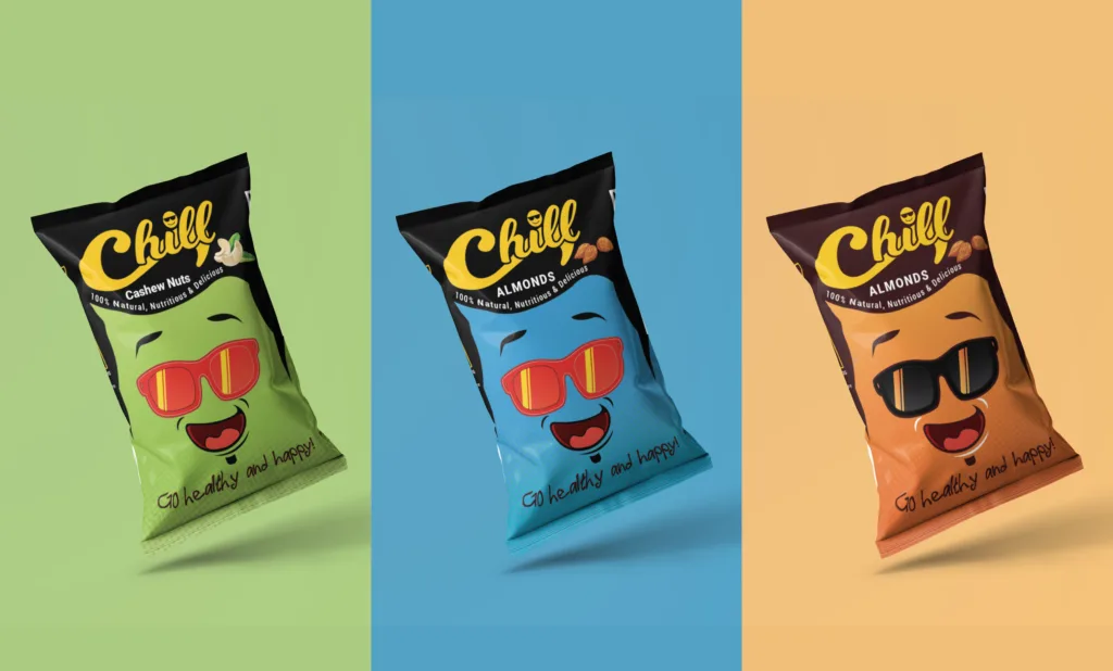
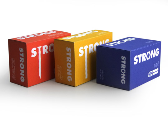
Color contrast: Utilizing a vibrant color scheme that contrasts against the background can help emphasize those colors even more. Dark colors, in particular, tend to attract attention and appear more intense.
Typography contrast: Using contrasting typefaces or font styles can create visual interest and hierarchy within the design. For example, pairing a bold sans-serif font with a delicate script font can create an appealing contrast.
Texture contrast: Incorporating different textures within the packaging design can create visual contrast and tactile interest. For example, combining a smooth surface with a textured pattern can add depth and intrigue.

Harmony is achieved when all elements within a composition work together cohesively, creating a sense of order, direction, and unity within the design scheme.
Color harmony: Selecting colors that work well together is crucial for achieving harmony. Designers can utilize color schemes such as monochromatic (varying shades of a single color), complementary (opposite colors on the color wheel), analogous (adjacent colors on the color wheel), or triadic (three evenly spaced colors on the color wheel).
Shape and form harmony: Consistency in shapes and forms used throughout the packaging design can create a sense of unity. Repeating shapes or incorporating related forms can establish a cohesive visual language.
Visual hierarchy: Establishing a clear visual hierarchy helps guide the viewer’s attention and creates a sense of order. This can be achieved through variations in size, color, typography, or placement of elements.
Typography plays a vital role in packaging design as it communicates important information and sets the tone for the brand. Here are some key considerations for typography in packaging design:
Legibility: Ensuring that the text is easily readable is crucial. Selecting appropriate typefaces, font sizes, and line spacing is important, especially considering the size limitations of packaging.
Brand consistency: Using consistent typography across different packaging variants helps establish brand recognition and reinforces the brand’s identity.
Hierarchy: Organizing text hierarchically allows for easy scanning and understanding. Utilizing variations in font size, weight, and style helps differentiate between headings, subheadings, and body text.

The use of imagery in packaging design can capture attention, convey the product’s message, and evoke emotions. Here are some considerations for incorporating imagery effectively:
Product representation: Showcasing the product prominently and accurately is essential. High-quality product images help consumers visualize the product and make informed purchasing decisions.
Visual storytelling: Utilizing imagery to tell a story can create an emotional connection with the consumer. A carefully chosen image that aligns with the brand’s narrative can enhance the overall packaging experience.
Appropriate style: Selecting an appropriate visual style that aligns with the brand identity and target audience is crucial. Whether it’s photography, illustration, or graphic elements, the style should resonate with the intended consumers.
Designing packaging that effectively communicates with shoppers and stands out from competitors requires a deep understanding of various design principles. By considering principles such as balance, contrast, harmony, typography, and imagery, designers can create compelling packaging designs that not only attract attention but also convey the brand’s message clearly. The key to successful packaging design lies in achieving a harmonious composition that resonates with the target audience and reinforces the brand’s identity.

No products in the cart.